Kaamfu’s mobile website follows the same core design philosophy as the desktop interface: clarity over clutter, purpose over decoration, and orientation before complexity.
The design is not just about layout. It is about making sure users always know where they are, what they can do next, and how to move forward without friction.
Why the Design Matters
Mobile interfaces fail when they try to do too much too early. Kaamfu’s mobile design prioritizes orientation, confidence, and momentum.
By clearly separating active features from previews, users always know what is available now and what is coming next. This prevents confusion while setting expectations for growth.
Design Principles
The mobile interface is built around a few key principles:
- Keep primary actions visible
- Reduce cognitive load
- Avoid deep or confusing navigation
- Design for growth without redesign
Every screen is intentional, even where features are still previews.
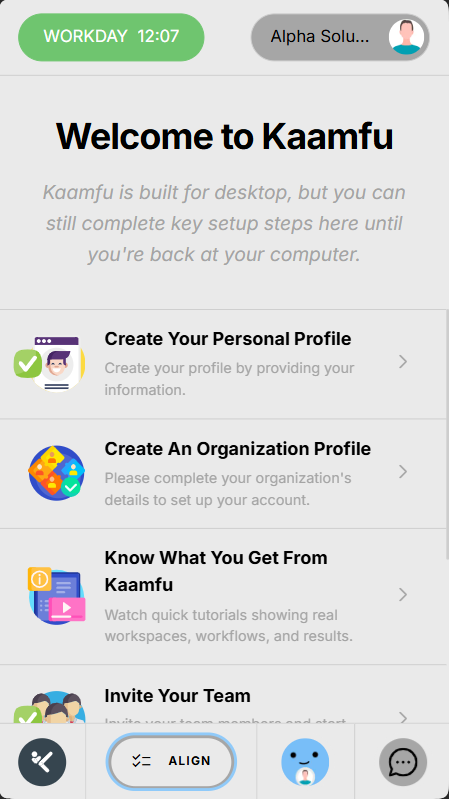
Top Row Structure
The top row anchors the most important controls and identity elements.
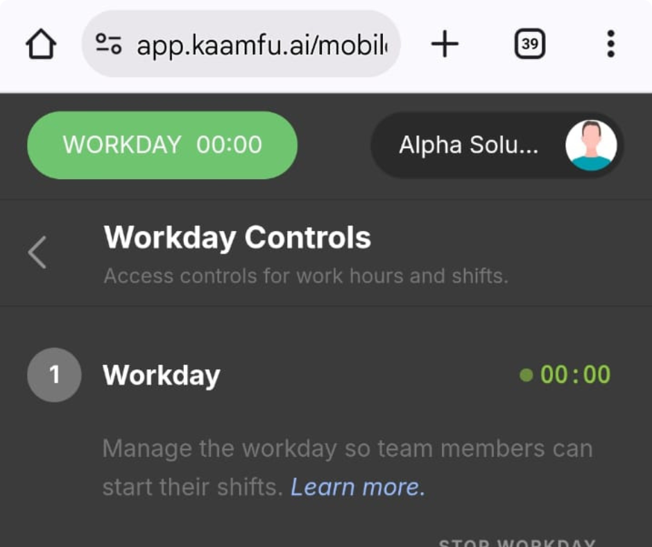
Workday Button (Left)
The workday button is the primary action control.
• Located on the top-left
• Opens the Workday Controls page
• Displays controls for workday, shift, and task
• Task controls are visible but not yet active
This ensures that starting work is never buried.
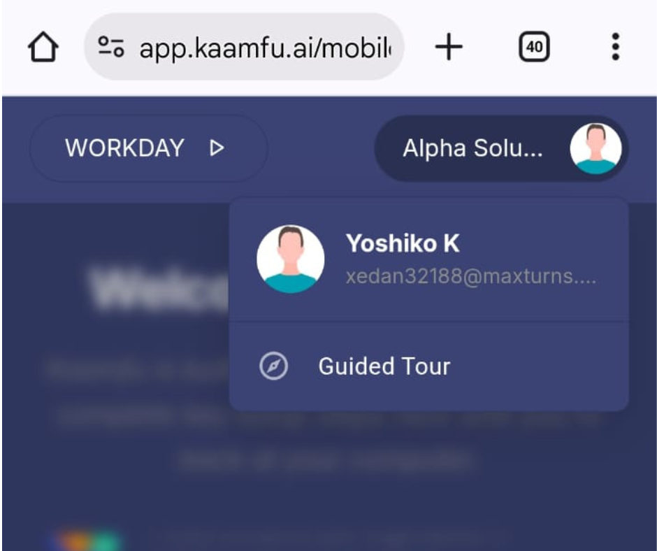
Profile Menu (Right)
The profile menu provides identity and guidance access.
- Located on the top-right
- Displays the user’s email
- Allows the guided tour to be started
Additional profile actions will be added here in future updates.
Central Content Area
The center of the screen is where all panels and pages are displayed.
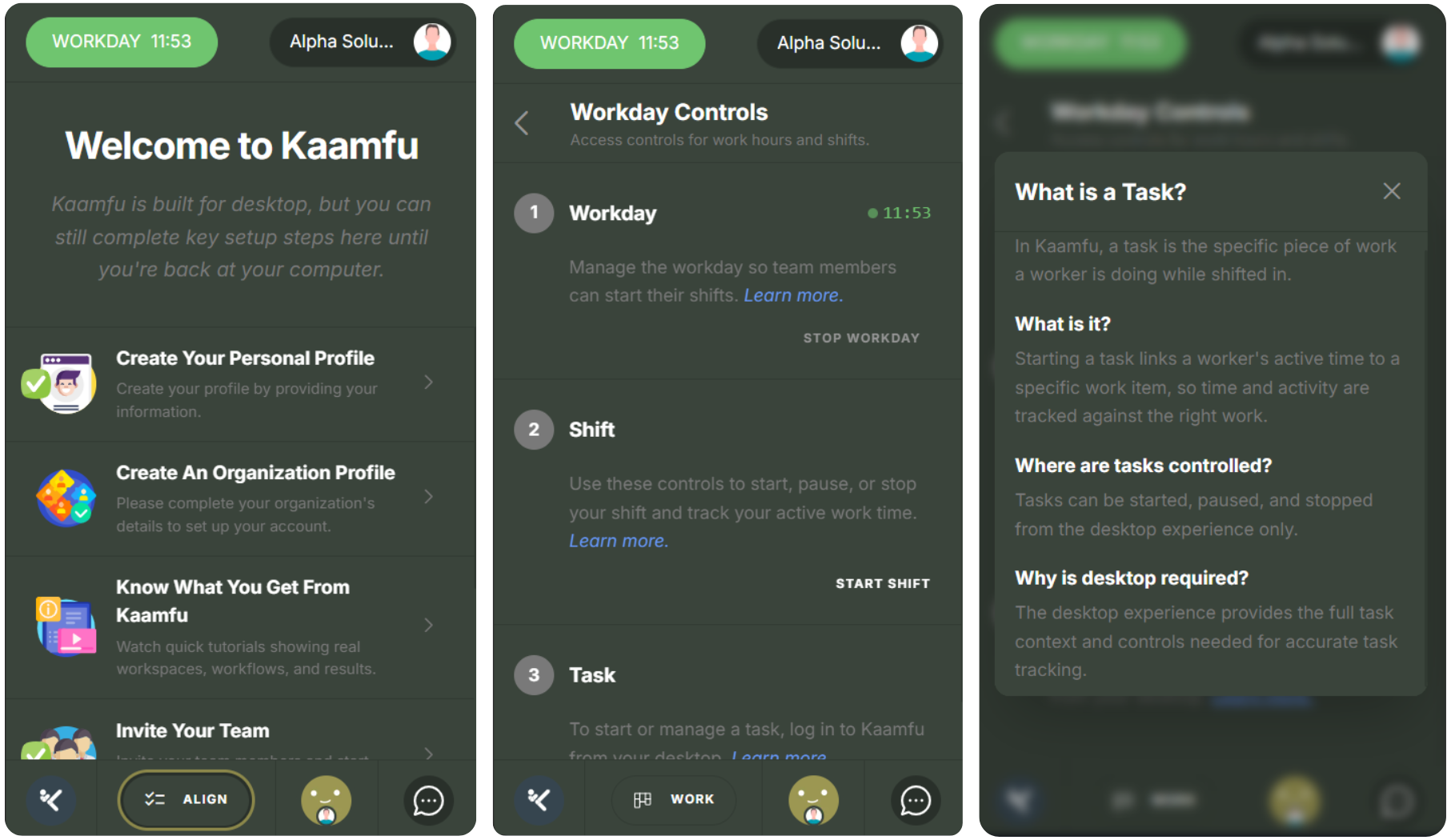
This area is designed to keep focus on a single task or view at a time:
- One primary panel per screen
- Clear headers for orientation
- A back arrow available on each screen
This reduces confusion and keeps navigation predictable.
Bottom Navigation Row
The bottom row provides directional awareness and future expansion.
Home Button
This is currently inactive and will open the dashboard view in a future release, stay tuned!
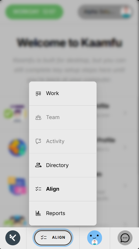
Navigation Menu
The navigation button opens a structured menu of available sections.
It includes:
• Work: A glimpse of the desktop Work panel
• Team: Currently disabled, coming soon
• Activity: Currently disabled, coming soon
• Directory: A glimpse of the global directory where Workstation Connect mandates are defined
• Align: Opens the mobile version of Align
• Reports: A glimpse of the Reports panel
Previewing these areas helps users understand what Kaamfu offers, even before full mobile support is enabled.
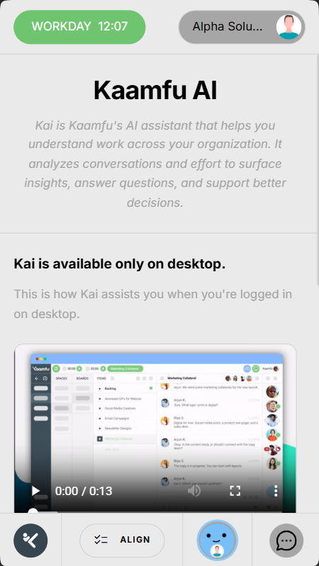
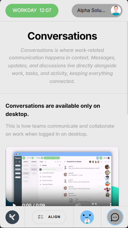
Kai Chat and Conversations
The bottom row also introduces communication capabilities.
• Kai Chat button: Shows a preview of the desktop Kai Chat experience
• Conversations icon: Shows a preview of the Conversations panel
Both features will be fully available on mobile in upcoming releases.