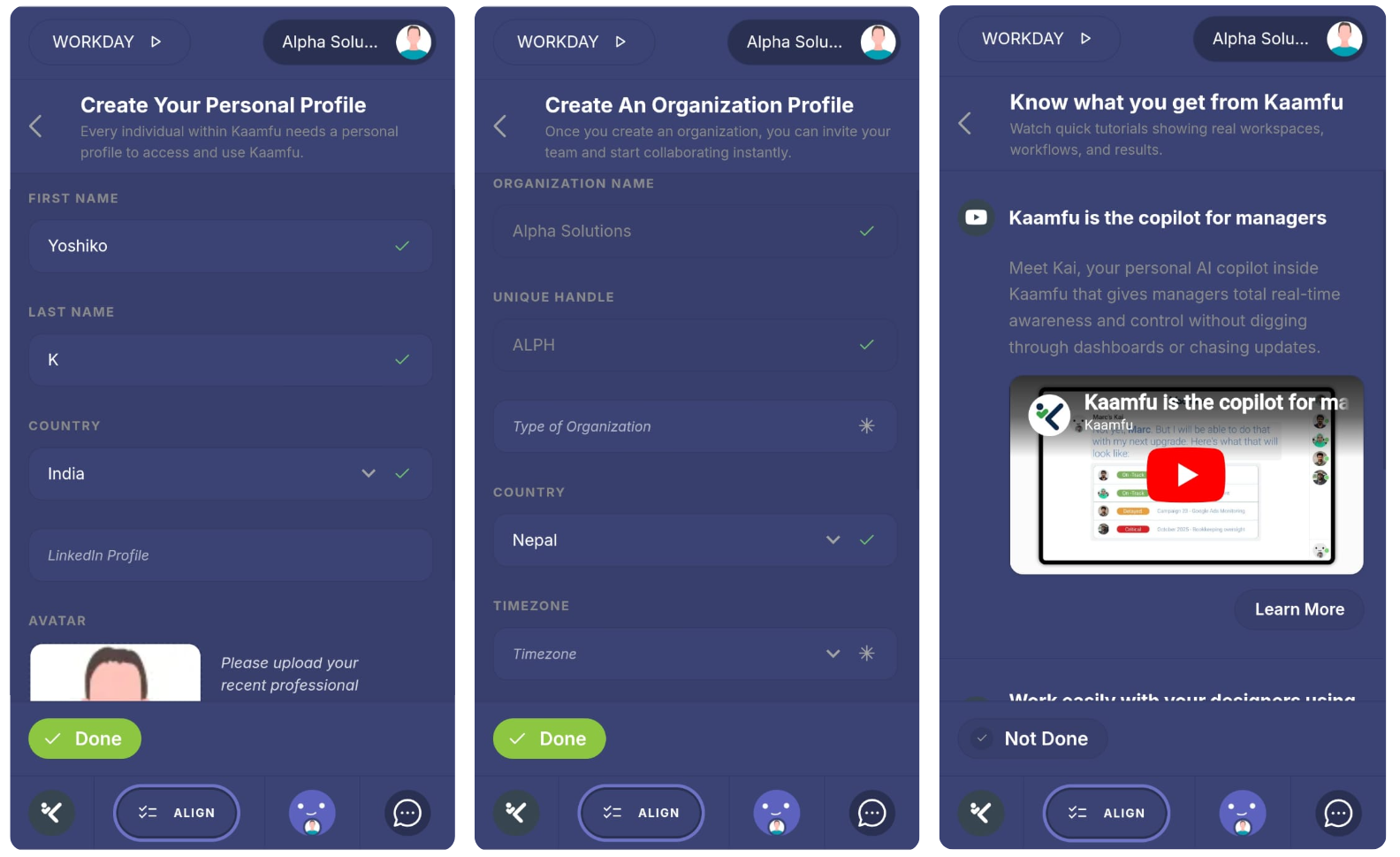
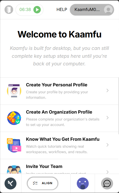
Kaamfu 2.1.9.9 addresses three things that have a direct effect on how teams adopt and use the product day to day. Teams moving from other tools need a reliable way to bring their history across without rebuilding from scratch. The surfaces teams use every hour should keep getting more capable with less friction. And when a team needs help, that help should be immediate and personal.
This release touches all of those areas. The import system has been rebuilt end to end, covering six platforms. The Conversation Panel has been extended into a more complete work surface. Mobile has its own dedicated experience for the first time. The Shift Bar surfaces the active task across more of the product. KAI takes a more proactive role in keeping managers informed. And direct access to the Kaamfu team is now built into the product on both desktop and mobile
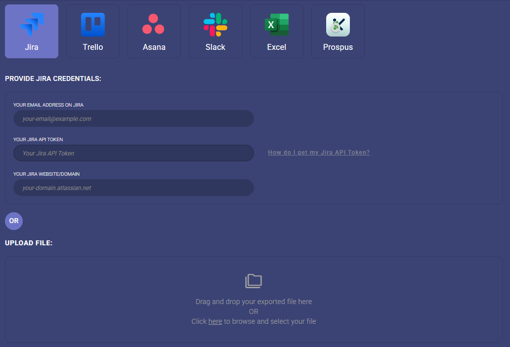
Import From Anywhere
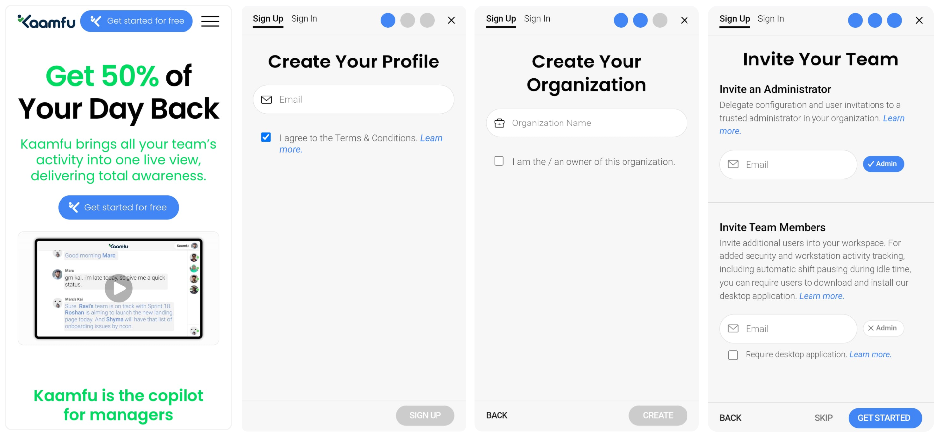
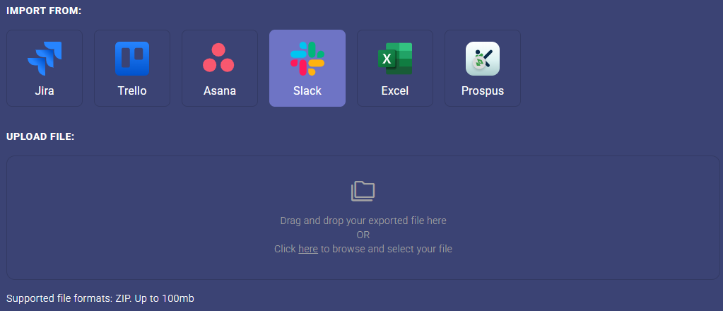
Kaamfu now imports full work history from Jira, Asana, Slack, Trello, Excel, and Prospus. Tasks arrive with their structure intact, conversations and comments are preserved, and file attachments travel with the items they belong to. Team members are mapped automatically, and if someone already exists in Kaamfu, the system identifies them without creating duplicates.
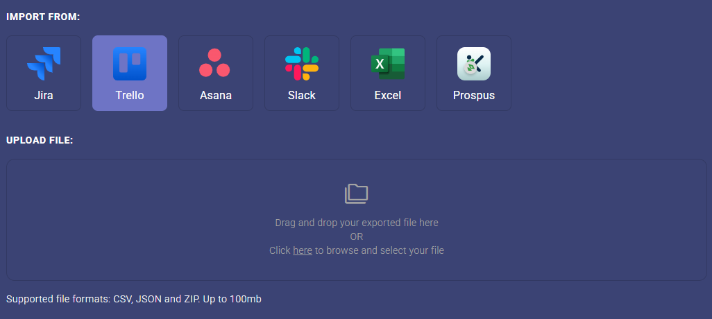
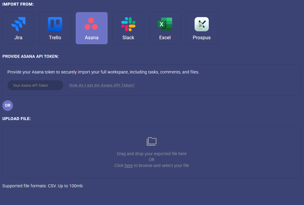
Former employees are handled separately: their history is preserved, but they are not re-invited. The import flow has been redesigned as a clear, step-by-step process with real-time progress tracking and a 100MB file size limit. Jira imports preserve parent-child task relationships. Slack imports include private channels. Asana imports support configurable field mapping. Each source is treated with the specificity the data requires.
Why This Matters
Migration has historically been one of the biggest barriers to switching project management tools. Here’s what what changes with this release:
- History moves with the team: Teams can switch to Kaamfu without accepting data loss as a condition. Tasks, conversations, attachments, and member history all transfer.
- Six platforms supported: Jira, Asana, Slack, Trello, Excel, and Prospus are all covered, with source-specific handling for how each platform structures its data.
- The process is predictable: Duplicate user detection, former employee handling, duplicate import warnings, and validation errors at every step mean the import behaves consistently and gives teams full visibility into what is happening.
For teams that have been holding off because of what migration requires, these three points address the core of that concern directly.
Supported Sources
Each source has been implemented with handling specific to how that platform exports its data. The level of fidelity varies by source but in each case the goal is the same:
- Jira: CSV and API automation. Parent-child task relationships and conversation history are preserved.
- Asana: CSV and API automation with configurable field mapping.
- Slack: Includes private channels.
- Trello: JSON and CSV, with correct status and archive handling.
- Excel: Custom template with updated column naming for clarity.
- Prospus: ZIP file import. Board structure, columns, and tasks are created automatically based on the data provided.
Support for these six sources covers the majority of the tools teams are moving from, and the list will continue to grow. For teams that have been reluctant to switch because of what migration requires, this release removes the primary obstacle. The work already done in other tools belongs to the team, and Kaamfu is now built to receive it fully.

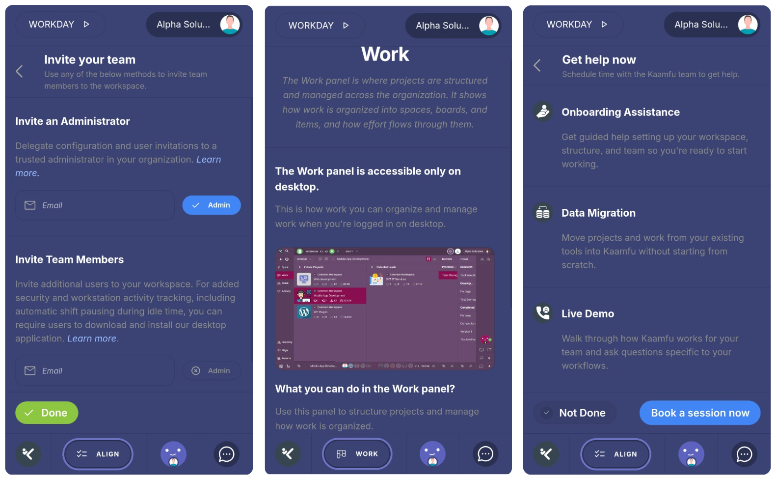
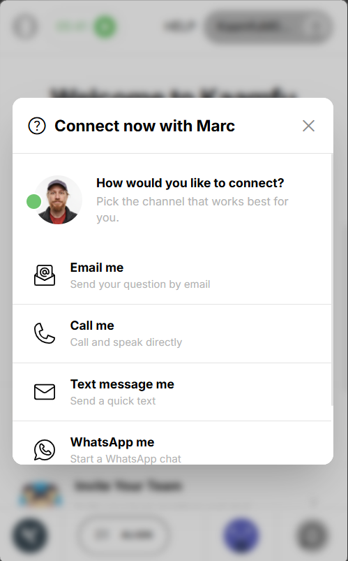
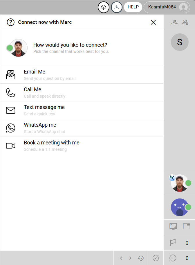
Connect With Our Founder in One Click
When a team runs into a problem, the path to getting help matters. A ticket queue adds delay and distance between the question and the answer. A knowledge base assumes the team can find and interpret what they need on their own. Neither approach works well when a team is onboarding, evaluating the product, or navigating something unfamiliar for the first time.
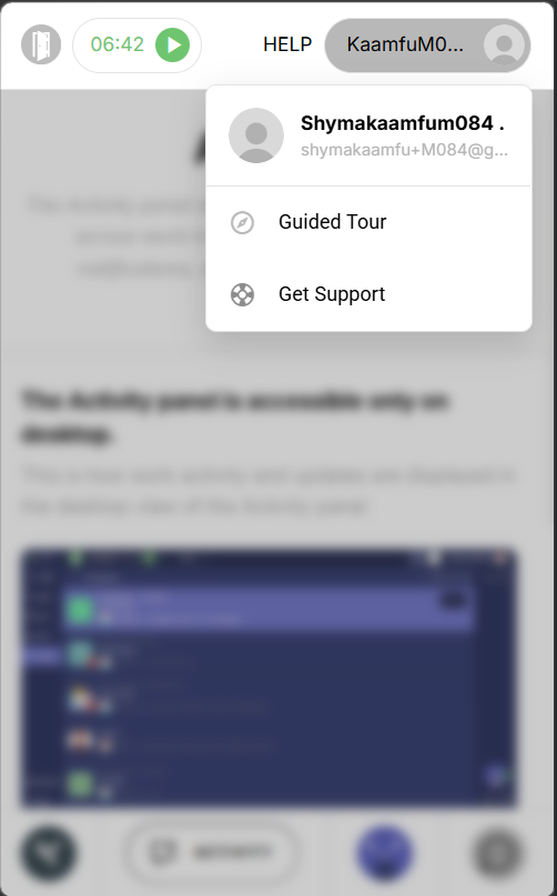
Kaamfu now gives org owners and admins direct access to Marc, the founder, from inside the product on both desktop and mobile. On desktop, Marc’s avatar appears on the Workline Status Panel with a green online indicator, in the same position where teammates appear. Clicking his avatar opens five ways to connect: book a session, call, text, WhatsApp, or email. A HELP button in the main application header provides the same access from any screen. On mobile, Get Support appears in the profile dropdown and connects to the same five options. Every interaction is logged, so the team can see when and how support is being used.
Why This Matters
Support that is visible and immediate changes how teams feel about using a product, especially during onboarding and early adoption. This is what it looks like in practice:
- Direct access to the founder: Org owners and admins can reach Marc without going through a support queue or searching for contact details.
- Available on every screen: The same five contact options are accessible from the Workline, the app header, and the mobile profile menu. The path to support is consistent regardless of how the product is being used.
- Visibility into support usage: Every click is tracked and logged, giving the team a clear picture of when and why users are reaching out.
Making support visible and immediate is a product decision, and it reflects a belief that the best software is built with the people using it close at hand.
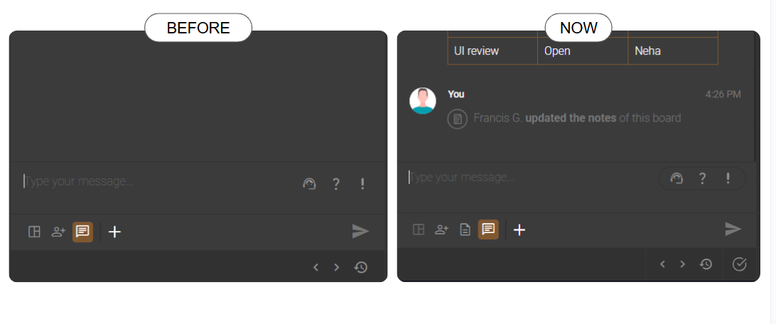
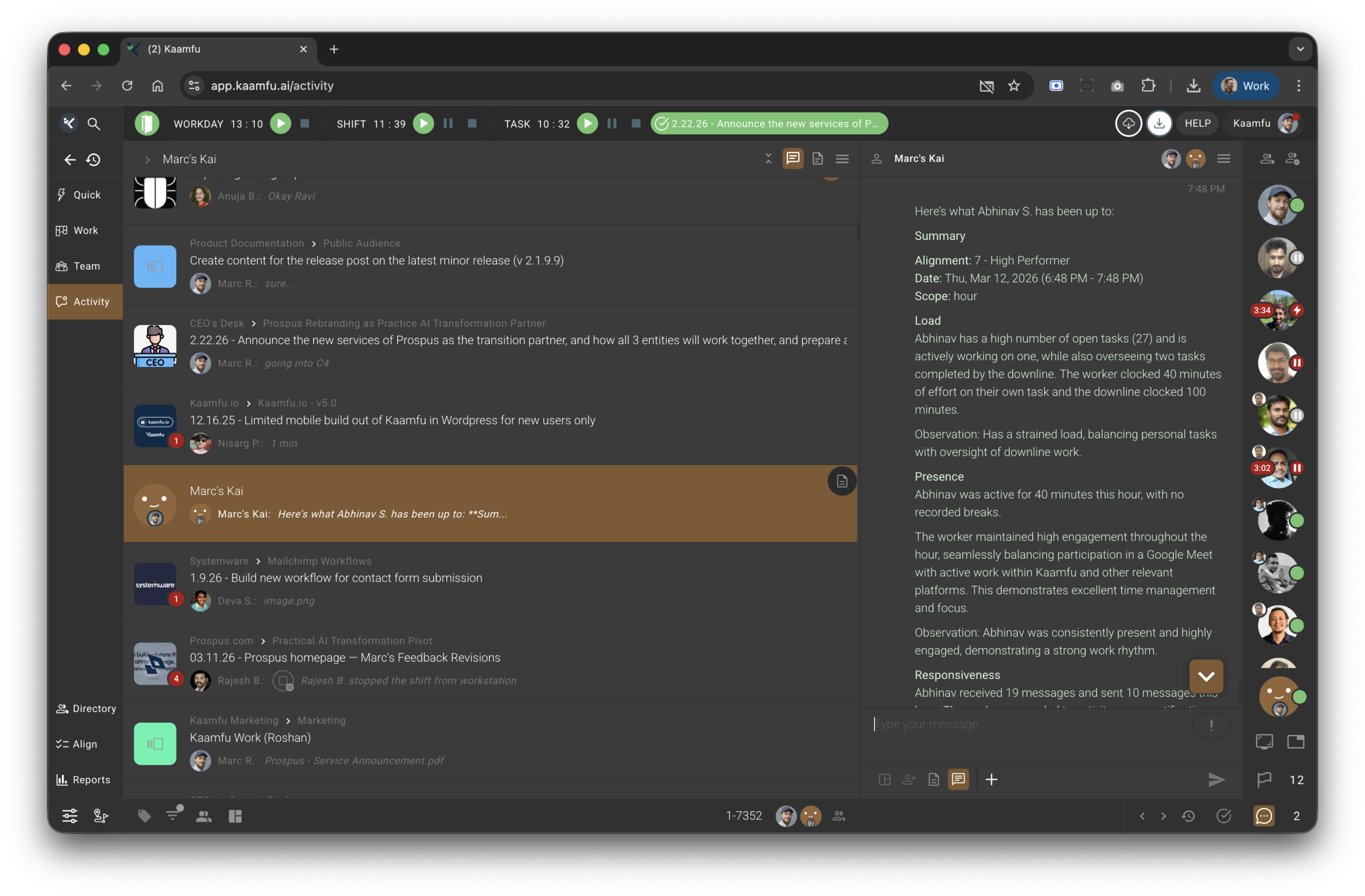
The Conversations Panel Is Now Even More Powerful
The Conversation Panel is where most of the active work in Kaamfu happens. Discussions, decisions, file sharing, effort tracking, and task context all live there. Over time, accessing related tools such as Notes and the active task has required navigating away from the panel, which breaks the flow of the work being done.
The panel has been extended to keep more of what users need within reach, without adding navigation or complexity. Every addition in this release is accessible from within the panel itself:
- Notes in the footer: Toggle the Notes panel directly from the conversation footer without navigating away or losing your place.
- Active task icon on the chin: The currently running task is visible at all times, regardless of which conversation is open, giving users a fixed reference point throughout the working session.
- Effort timer, side by side: Today’s clocked time and the assignee’s total clocked time are displayed together, readable at a glance without opening anything else.
- Scroll-to-latest arrow: When reviewing older messages, a single click returns to the most recent message in the conversation.
- Larger file uploads: Files up to 100MB can be uploaded directly in the conversation, including SVG files.
- Redesigned request icons: Attention Request, Support Request, and Status Request icons now use a pill-style design that makes them easier to identify and act on.
Each of these changes targets a specific moment in the working session where users previously had to leave the conversation or work around a limitation to get something done.
Why This Matters
The value of these changes is in how they reduce the number of times a user has to leave a conversation to do something related to it. Here’s what this means:
- Fewer reasons to leave the conversation: Notes, the active task, and effort data are all accessible from within the panel. Work stays in context.
- The running task stays in view: The active task icon on the chin does not change based on which conversation is open, so users always know what is running without needing to check the Shift Bar.
- The panel handles more: Larger file uploads, SVG support, and cleaner request icons extend what the Conversation Panel can do without changing how it feels to use.
Each of these points addresses a specific friction in how teams currently move through the product, and together they add up to a noticeably smoother working session.
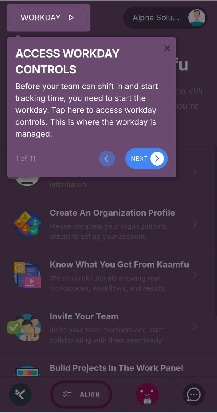
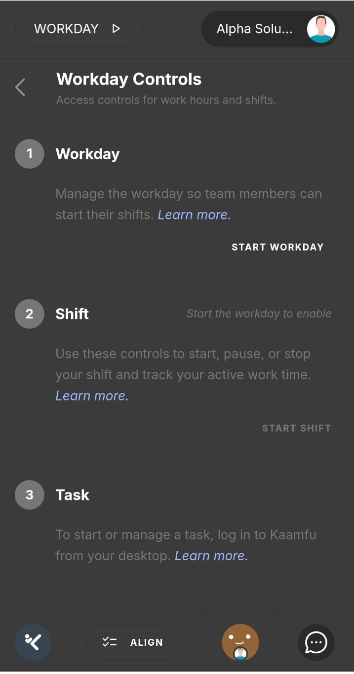
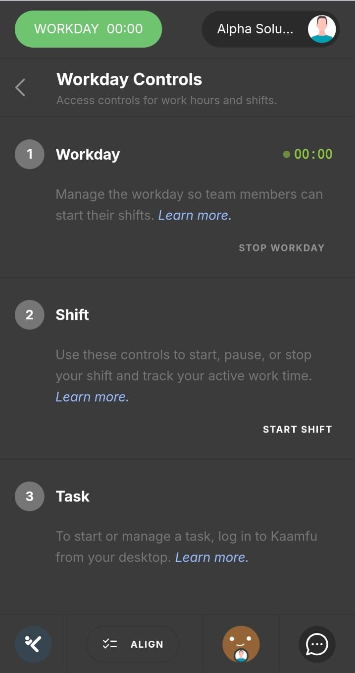
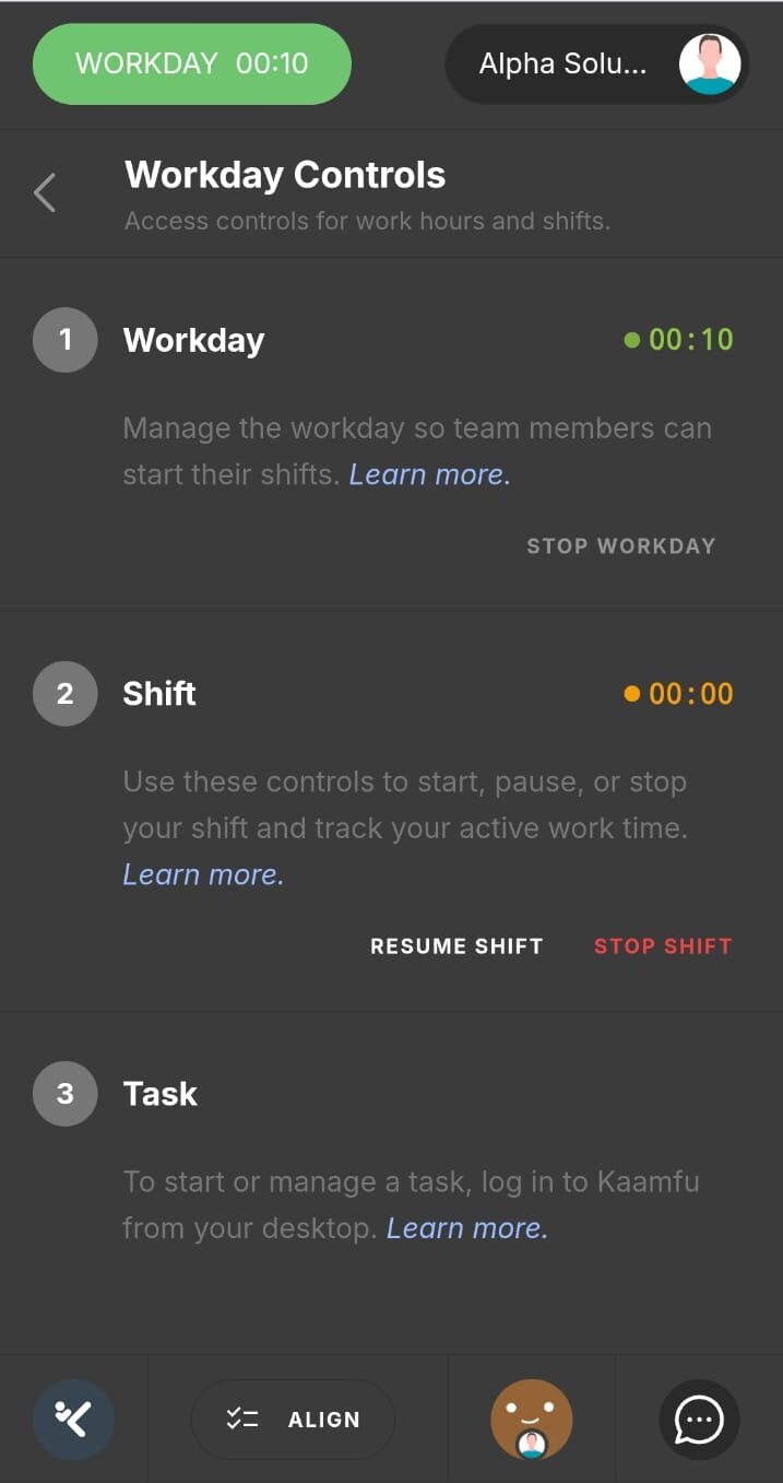
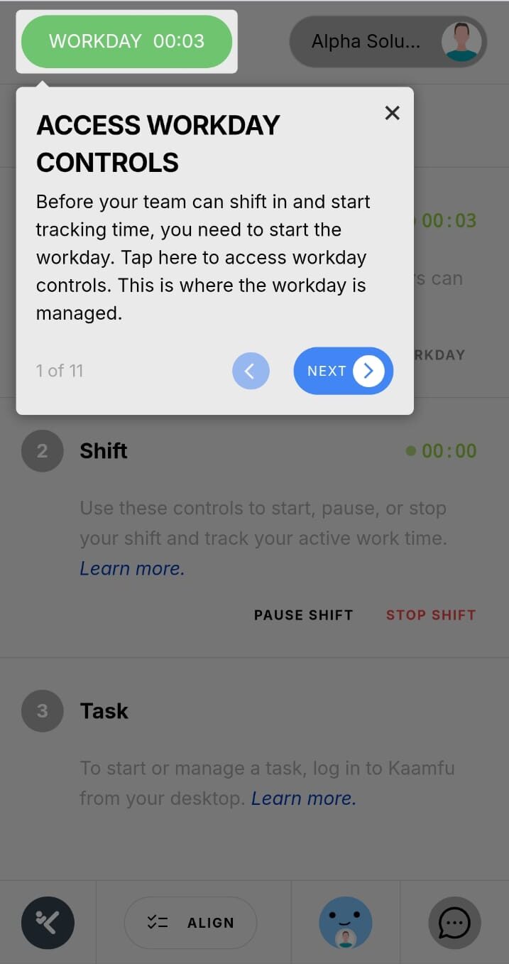
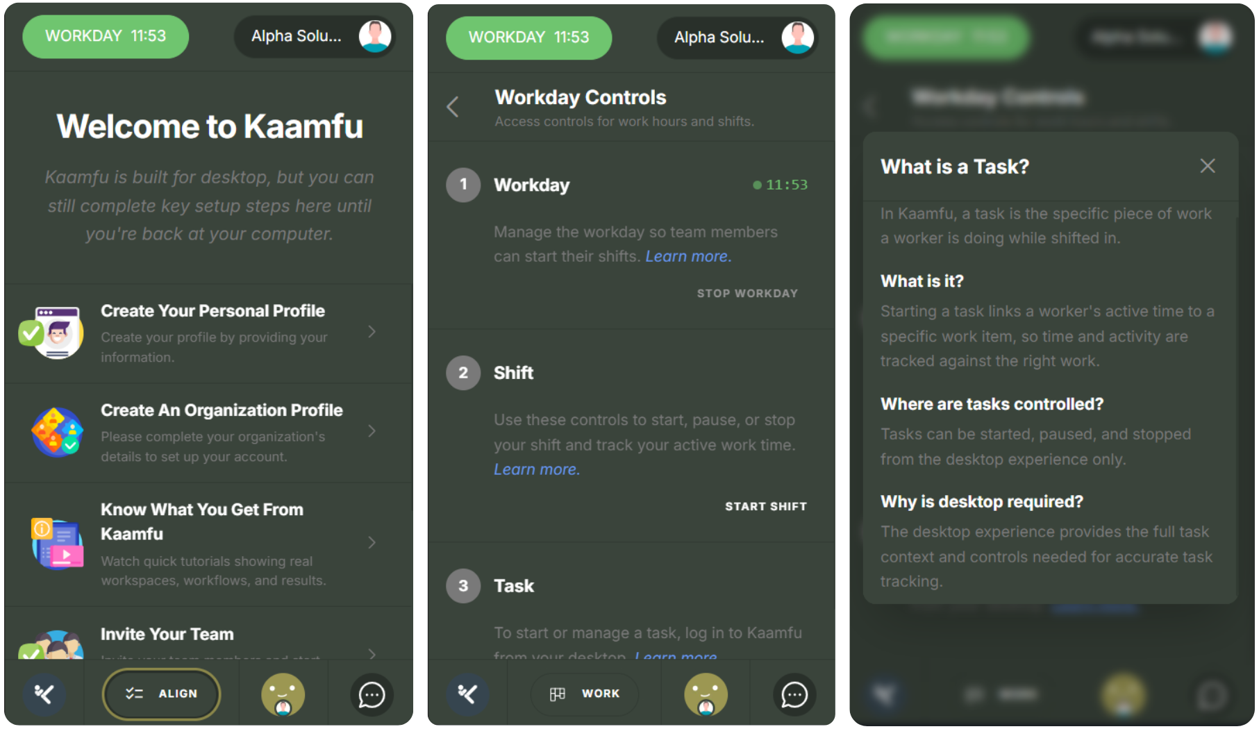
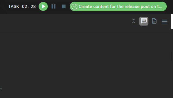
Switch Tasks Instantly with the Active Task Menu
As users move between conversations and panels, the task they are running becomes harder to see and act on without returning to the Shift Bar directly. This release puts the active task in front of users across more of the product, without requiring any extra steps.
The active task icon now appears on the Conversation Panel chin and stays there regardless of which conversation is open. Clicking it once opens the task dropdown. Double-clicking opens the task’s conversation directly. The Resume and Start buttons now appear on the task effort display in the Shift Bar, which is where users are already looking when they want to act on a paused task. A visual indicator on the task pill confirms at a glance whether a task is currently running. When a session ends with no task running or paused, the Shift Bar displays a clear prompt to start the next task.
Why This Matters
Task visibility and task switching are related problems. When users cannot easily see what is running, deliberate task management becomes harder. These points explain how this release addresses both.
- The active task stays visible: The chin icon persists across all conversations, so users always have a reference point for what is running without leaving what they are doing.
- Task switching requires fewer steps: The dropdown from the chin icon and the Resume button on the effort display both reduce the number of actions needed to switch between tasks.
- Gaps in tracking are surfaced: The prompt that appears when no task is running gives users an immediate signal that time is passing untracked, rather than letting it go unnoticed.
These three changes work together: visibility leads to awareness, awareness leads to action, and the prompt closes the loop when a session goes quiet.
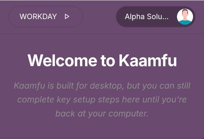
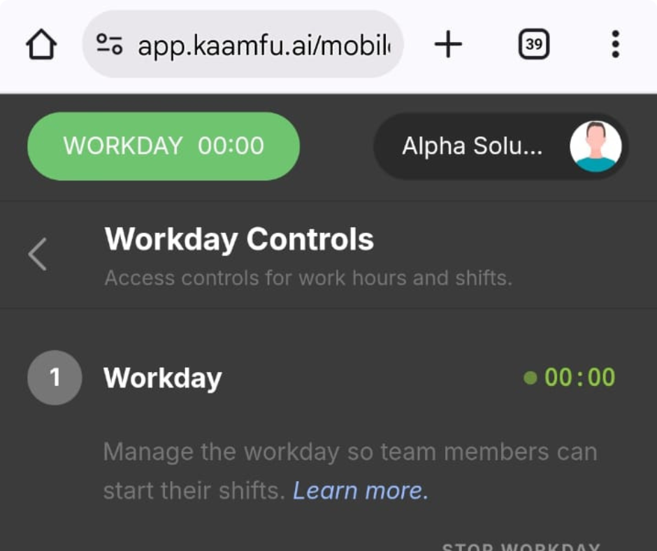
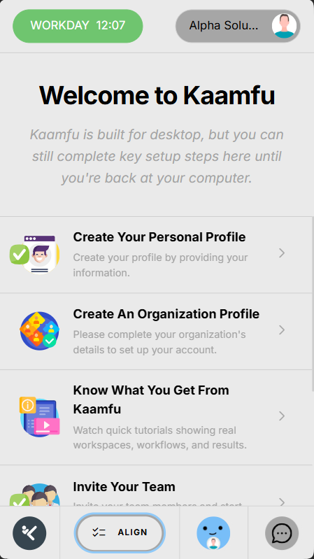
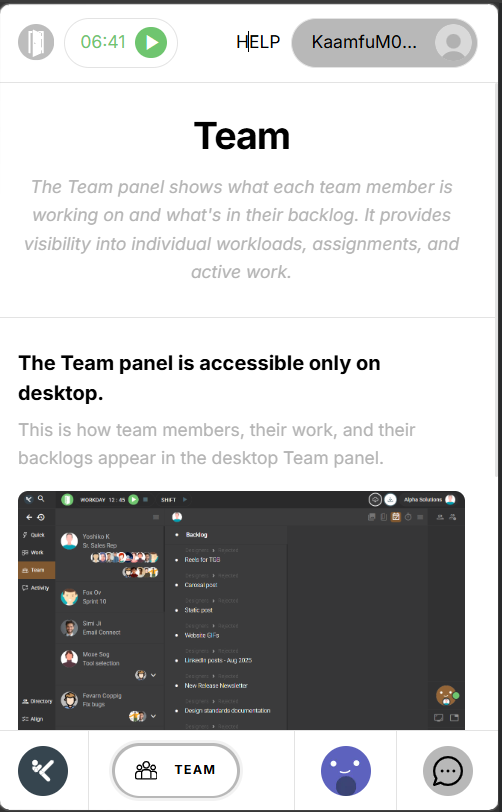
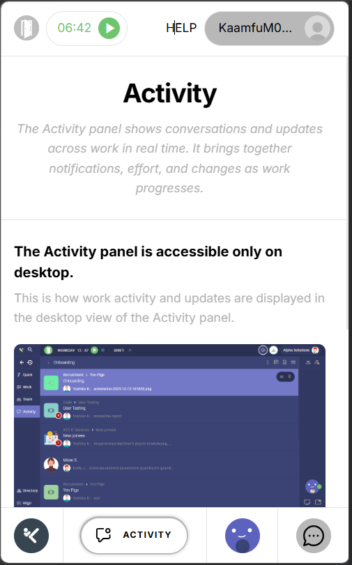
A Dedicated Mobile Experience
Kaamfu’s mobile website has previously shared the same theme and interface structure as the desktop version. This release gives the mobile website its own foundation.
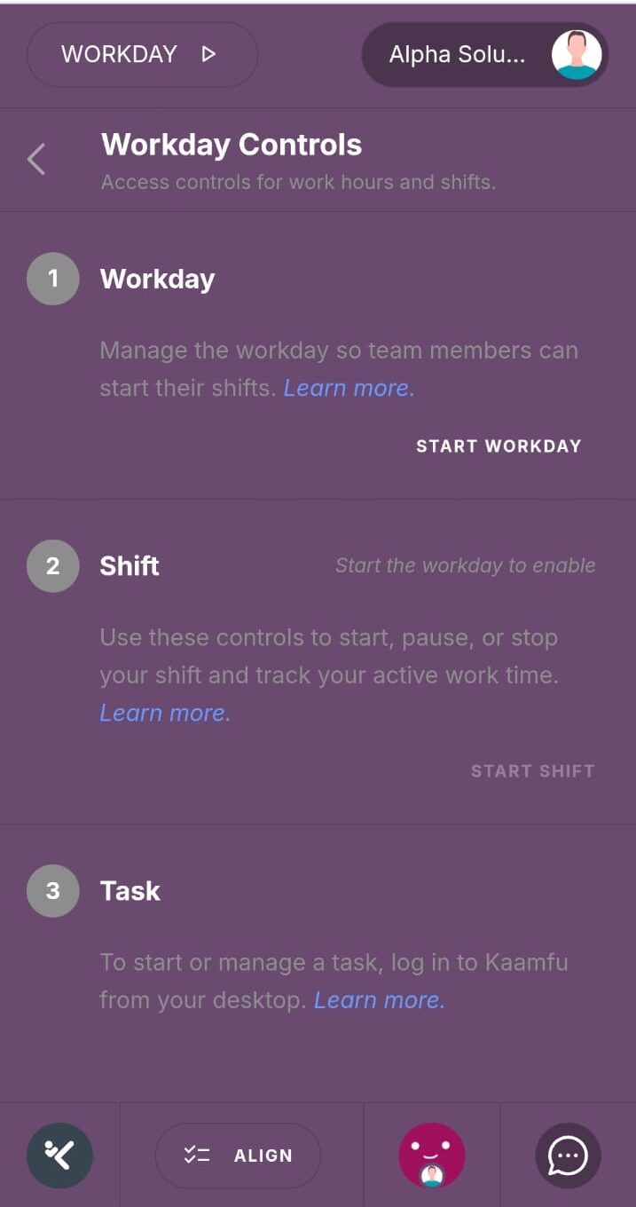
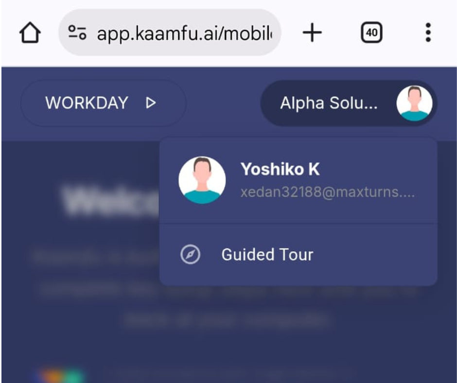
The mobile website now has its own dedicated theme: clean, monochrome, and built specifically for smaller screens. It applies automatically when users access Kaamfu on a mobile device and is independent of whatever theme is set on desktop. The Team and Activity panels are now available from the mobile footer menu, each with a dedicated page. The header has been simplified to show the Workday icon alongside the current shift duration, giving users a clear view of their session status without the complexity of the desktop version. Get Support appears in the mobile profile dropdown and connects directly to all five ways to reach the Kaamfu team.
Why This Matters
A mobile experience that is purpose-built rather than adapted performs differently for the people using it. These three points cover what this release changes.
- Mobile has its own visual foundation: The monochrome mobile theme is designed for the screen size it runs on, rather than inheriting settings from a desktop layout that were not built for it.
- More of the product is accessible on mobile: Team and Activity panels in the footer menu expand what users can see and do when they are away from their desk.
- Support and session status are always reachable: Shift duration in the header and Get Support in the profile dropdown are accessible from every screen in the mobile experience.
Together, these changes mean that a user on mobile is working with a product that was designed for that context, not one that was compressed to fit it.
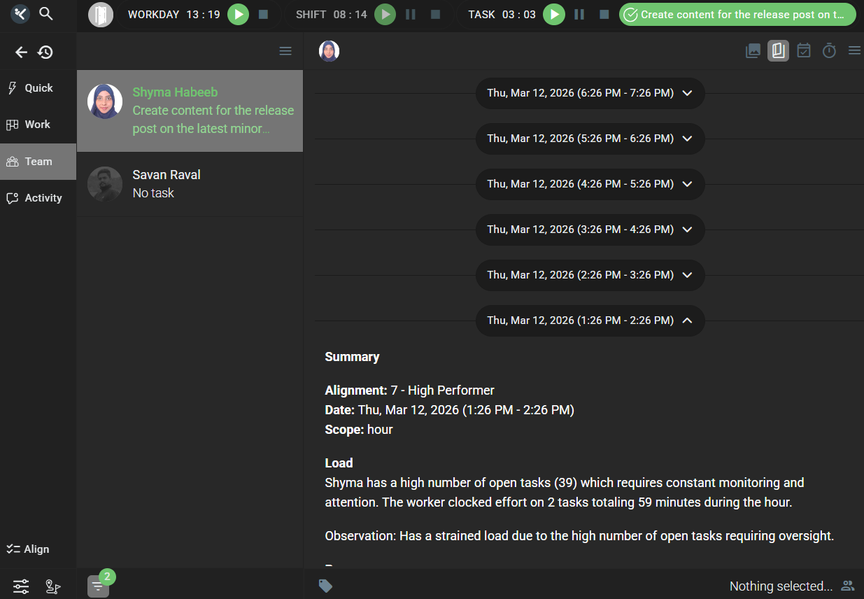
KAI Now Alerts Your Manager Automatically
KAI generates hourly user stories throughout the working day: structured, plain-language summaries of what each team member is working on, how far through it they are, and how they are engaging with their tasks. These stories have been available in the Team panel for managers to review, but reviewing them has required the manager to go looking.
When a team member’s task end time is within three hours, KAI now sends that story directly to the member’s manager as a direct message, without any action required from either side. The manager receives the information while there is still time to respond to it.
User stories in the Team panel are now collapsible, making it easier to move through a team member’s history. Story generation is more consistent across weekly and monthly timeframes, and stories are no longer generated for disassociated or inactive users.
Why This Matters
Proactive information delivery changes the dynamic between a manager and their team. These three points explain the significance of this change.
- Managers receive information when it is still useful: A three-hour window gives the manager enough time to act, whether that means offering support, adjusting scope, or simply acknowledging the situation.
- The alert requires nothing from anyone: KAI sends the message based on what it observes in the story data. There is no trigger, no request, and no dashboard to check.
- Stories are more reliable and easier to use: Collapsible views in the Team panel, more consistent generation across timeframes, and filtering of inactive users all make stories a more dependable part of daily work.
The result is a manager who is informed at the right moment, without either side having to do anything to make that happen.
More in This Release
In addition to the features covered above, a range of further improvements have shipped across the Work Panel, visual design, performance, and security. These changes are smaller in scope but consistent in direction: making Kaamfu cleaner, faster, and more reliable across the board.
Work Panel
Three changes improve how spaces, boards, and team members are represented and counted across the Work Panel.
- Default Space avatars have been updated to more professional icons across the Spaces Subpanel.
- KAI member counts are now shown separately from human member counts on Space and Board cards, giving a clearer picture of team composition at a glance.
- Assignee and assigner avatars on the Board Dashboard are now ordered by role hierarchy and sorted alphabetically within each role.
Each of these addresses a specific readability gap that becomes more noticeable as organizations grow and boards multiply.
Collectively, the Work Panel is now easier to scan, easier to interpret, and more consistent in how it represents the structure of the teams and spaces within it.
Visual Design
Two updates affect the default visual presentation of the product, both in the main application and on the pages users encounter before they sign in.
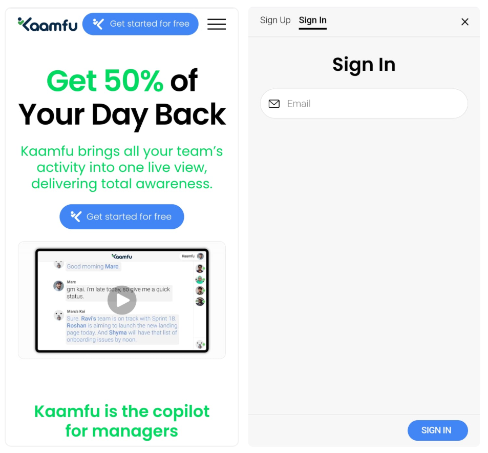
- The default web theme has changed from blue to monochrome, giving Kaamfu a cleaner out-of-the-box appearance.
- The Sign In, Sign Up, OTP, and Forgot Password pages have been updated from the previous blue design to a clean white and grey layout.
Both changes move the product toward a more neutral visual baseline, which works better across a wider range of team and organizational contexts.
For new users, these are among the first things they see. A cleaner, more professional presentation sets a more accurate expectation of what Kaamfu is.
Performance
Real-time sync events across the platform are now processed in batches of 100 rather than individually. For organizations with many active users working simultaneously, this reduces load during collaborative sessions and keeps the product performing consistently under pressure.
Security
Cross-Origin security headers have been added across the platform following a scheduled security audit. This strengthens protection against common web vulnerabilities and applies to all accounts with no configuration required.
Taken together, these changes reflect the same principle that runs through the rest of this release: every part of the product should work better than it did before, for everyone using it.