Export PDF
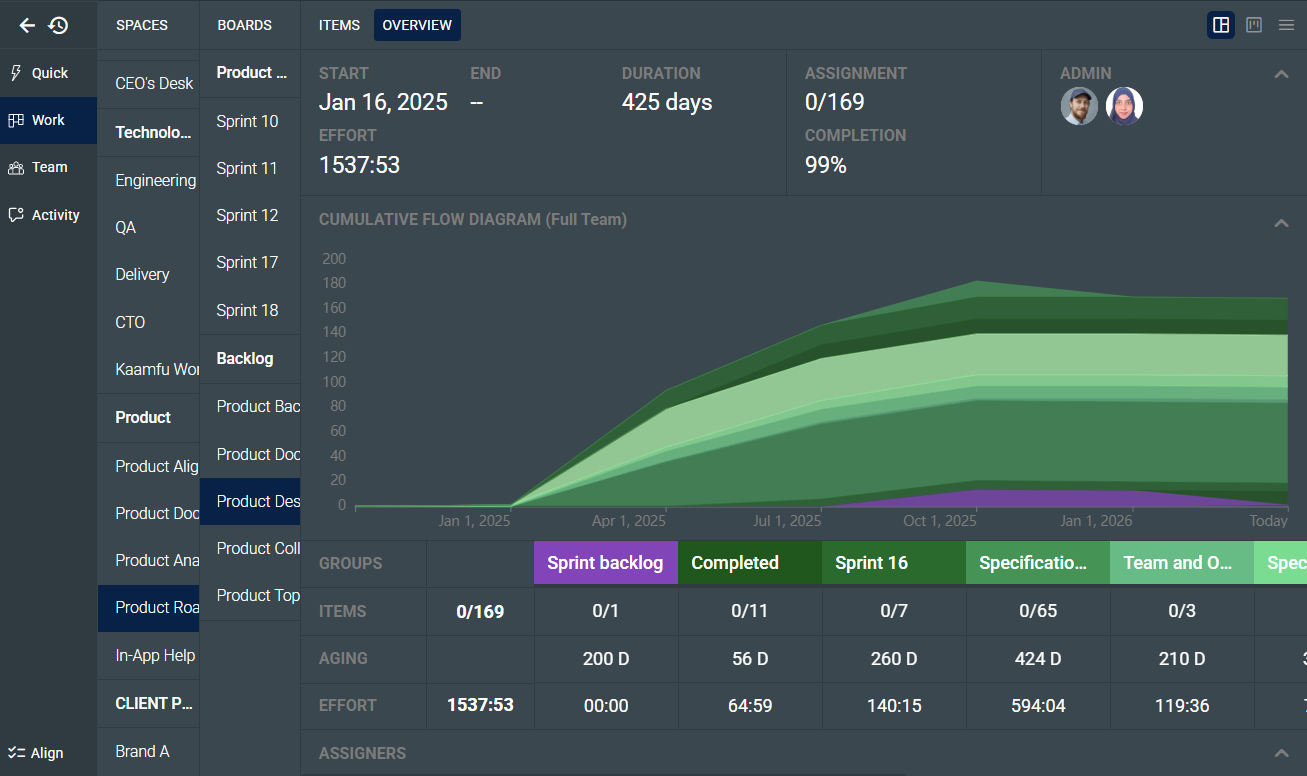
SUMMARY
Most project boards give managers the same view as the people doing the work: a list of tasks and their current states. That view is useful for execution but leaves leaders without the structural read they need to make decisions. Kaamfu’s board-level dashboard gives managers a structured view of what is happening inside a board without requiring them to dig through individual tasks or wait for someone to compile the data.
IN BRIEF
- Managers lack direct visibility – Project boards show task states but rarely surface what leaders actually need to make decisions.
- Status updates fill the gap – Teams compensate with recurring syncs and manual reports that are already outdated by the time they are shared.
- Delayed data costs time – When visibility depends on human assembly, course corrections happen after problems have already compounded.
- Structured board analysis required – The Board-Level Dashboard in Kaamfu surfaces effort, flow, aging, and workload directly from live board data.
- Kaamfu removes the translation layer – Kaamfu gives managers a real-time operational view without requiring them to leave the board or request a report.
There is a specific kind of meeting that happens on almost every project. The manager calls it because they need to know where things stand. The team attends, gives updates, and the manager leaves with a rough picture that will be partly outdated within 48 hours. The meeting itself is not the problem. The problem is that the tool being used to run the project cannot answer the questions the manager is actually asking, so the meeting has to do it instead.
Those questions are not complicated. How much work has been done? Is it moving at a pace that makes the deadline realistic? Is one person carrying significantly more than the others? These are standard management questions that should be answerable by looking at the board. In most cases, the standard board view cannot surface them, because it shows where tasks are, not how the project is behaving as a whole.
Inside Kaamfu’s Work panel, selecting a board and navigating to the Items panel gives you the execution view: tasks organized in columns by status. Switching to the Overview tab shifts the entire panel into a dashboard that reads the same board’s data and surfaces it as analysis. No separate tool, no report request, no waiting.
What the Dashboard Shows
The board-level dashboard is accessed by selecting any board, navigating to the Items panel, and switching to the Overview tab. Everything it displays is drawn directly from the board’s live data, with no separate setup or reporting layer required.
The dashboard is organized into five blocks, each surfacing a different layer of the board’s data:
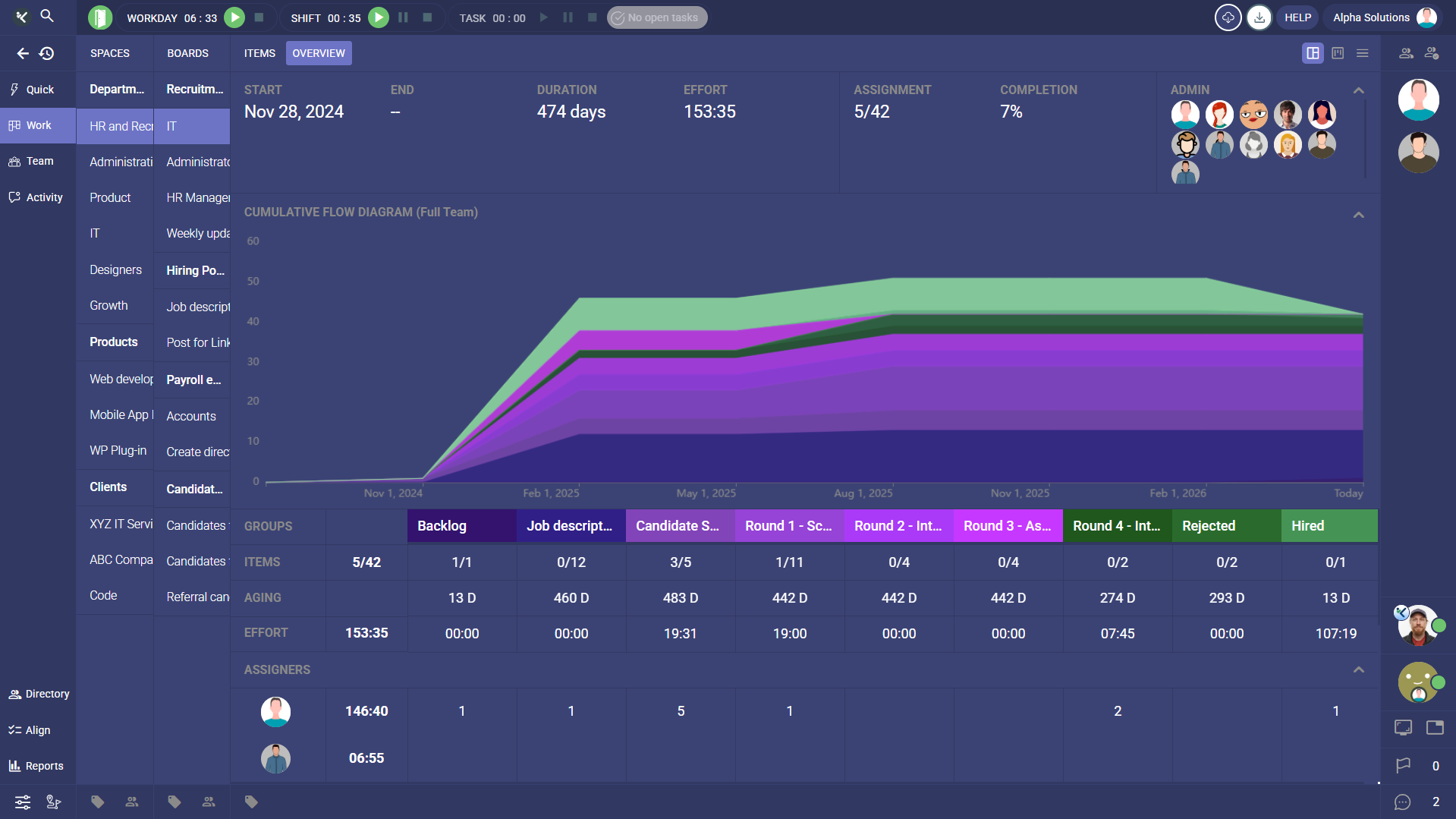
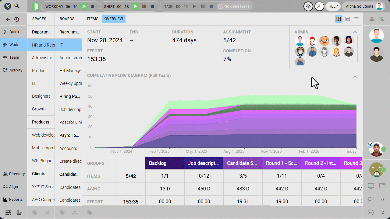
- Top row – Start date, total effort logged, completion percentage, and assignment ratio, giving a headline read on the board’s current state.
- Cumulative Flow Diagram – A visual record of how tasks have moved through the board’s item groups over time, showing flow and accumulation across the project’s timeline.
- Groups – A breakdown of each item group by item count, task aging, and total effort logged, making it possible to compare the health of different parts of the project.
- Assigners – The distribution of task assignments by person and group, showing who has been allocating work and where.
- Assignees – The distribution of assigned tasks by person and group, surfacing how workload is spread across the team.
Each block answers a different question, and together they give a manager a complete read on the board’s structure, pace, and people without touching a single individual task.
From Kanban to Overview: Seeing How a Project Moved
The most direct shift in how leaders experience a board happens when they switch from the column view to the Overview tab. The column view shows where each task sits right now. The Overview tab shows how the project has been moving across its entire timeline, which is the information a leader typically needs before a review, a resource decision, or a client conversation.
That toggle is where the Cumulative Flow Diagram becomes useful. Each band in the diagram represents an item group on the board, and the width of each band at any point in time reflects how many tasks were in that state on that date. A project where bands are growing proportionally is flowing. A project where one band expands while others stay flat has work accumulating in a specific stage, which is a bottleneck forming in real time. A manager who checks this view at the start of week three can see exactly how the project moved in weeks one and two.
Reading the CFD: What the Colors Tell You
The color distribution makes the health of that flow immediately readable. Green bands represent closed item groups where tasks have been completed. Purple and violet hues represent open and in-progress groups where tasks are still active. A diagram with growing green means the project is closing out work at a consistent rate. A diagram dominated by purple means tasks are sitting in active states without reaching done, which is worth addressing before it compounds. The color balance alone gives a manager a faster read on project momentum than any status update would.
Before a status meeting, before a client update, or before a decision about resourcing, a leader can open the Overview tab and read the project’s trajectory in under a minute. They enter the conversation with context rather than collecting it during the conversation. Over the course of a project, that shift from discovery to decision-making is where significant time gets recovered.
Effort and Workload Without a Report
Effort visibility is one of the most consistent gaps in standard board views. Tasks get completed, but whether the time invested was proportional across the team is rarely visible without building a separate report or asking people directly.
The dashboard surfaces this at two levels. At the group level, managers can see how many hours have been logged against each item group, which makes it possible to spot where the project’s effort is concentrated and whether it aligns with where completion is happening. At the individual level, the Assignees section shows how tasks and hours are distributed across each person on the board. When one person has logged significantly more than another working on the same project, the imbalance is visible immediately without anyone having to flag it.
Workload imbalance is one of the more preventable contributors to late deliveries, and it tends to go unaddressed not because managers ignore it but because the information is not in front of them until someone raises it. Putting it in the board view changes when the conversation about rebalancing can happen.
Making It a Habit
When the board can answer the questions a manager is actually asking, the manager does not need to build a separate process to collect those answers. The board-level dashboard works because it reads data the team is already producing and surfaces it in a form that is useful to the people responsible for delivery. The team changes nothing about how they work.
The leaders who get the most out of it are the ones who check it regularly rather than only when something feels wrong. A few habits that take minutes individually but prevent significant late-stage problems:
- Weekly CFD review – Check whether green is growing relative to purple, and whether any band has been widening without movement into closed groups.
- Color check before reviews – A quick look at the CFD before any status meeting tells a leader whether the project is closing work or accumulating it, before anyone has said a word.
- Assignees glance near deadlines – Review workload distribution when a deadline is approaching to catch imbalances before they affect delivery.
All three happen inside the board the team is already working in, which is what makes them sustainable.